Decorative painting ….transferring Typography! How does she do it?!
Many people wonder, some ask. I respond, …”it is not hard! And let me help you.” (and by the way- we do sell Chalk Paint® on line HERE for $37.99 per quart and SHIP YOUR ORDER OUT THE SAME DAY YOU PLACE IT- if placed by 3pm Eastern Time!)
Yes, I get asked that often with pieces that I do. So, although this post is all over the place when it comes to topics, I am sharing with you:
1. a great website source for getting free images and typography from. (yes, I wrote FREE!)
2. my typical approach to doing image projects like this.
3. information on applying Dark Wax (there are many ways to use Dark Wax by the way!)
4. And a new product called Transfer Gel by Artisan Enhancements® that we sell – which is another option to help you make amazing pieces also. Click HERE to see this product.
 I am always scheming and thinking about how I want to paint my next piece, but sometimes I need inspiration. So, what’s a girl to do, except for to call on her Fairy Godmother! Well, who I actually am referring to is The Graphics Fairy LLC ! She has never let me down! (ps if you visit her Facebook page- please let her know The Purple Painted Lady sent you!)
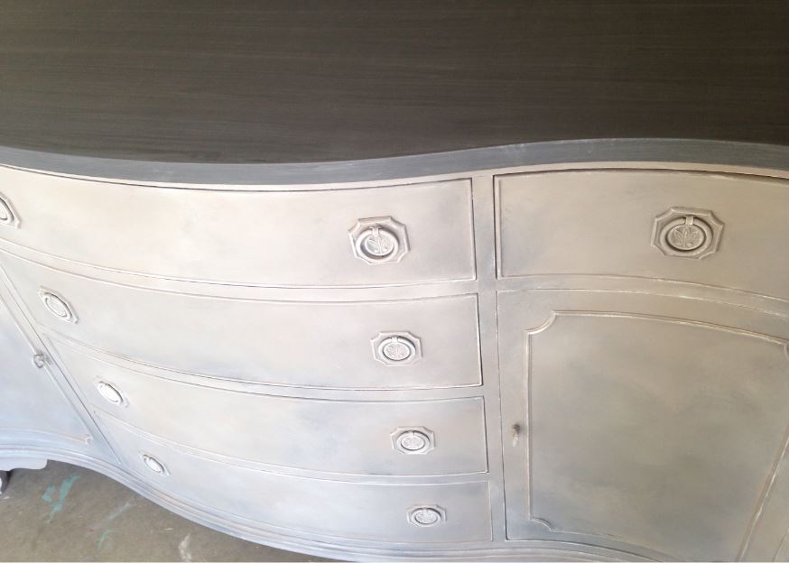
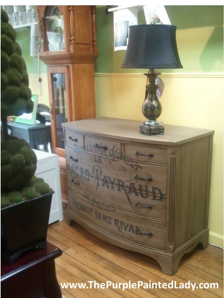
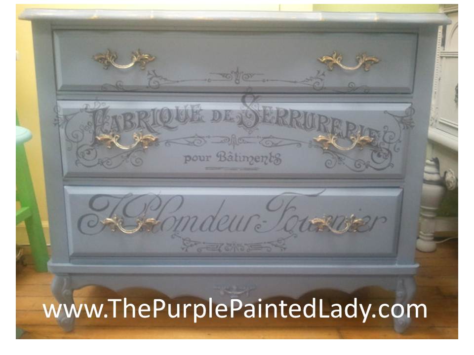
Below I will share with you the steps took to create this funky painted dresser. 
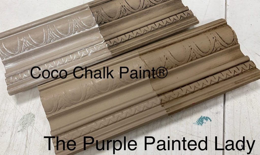
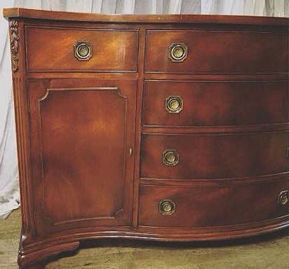
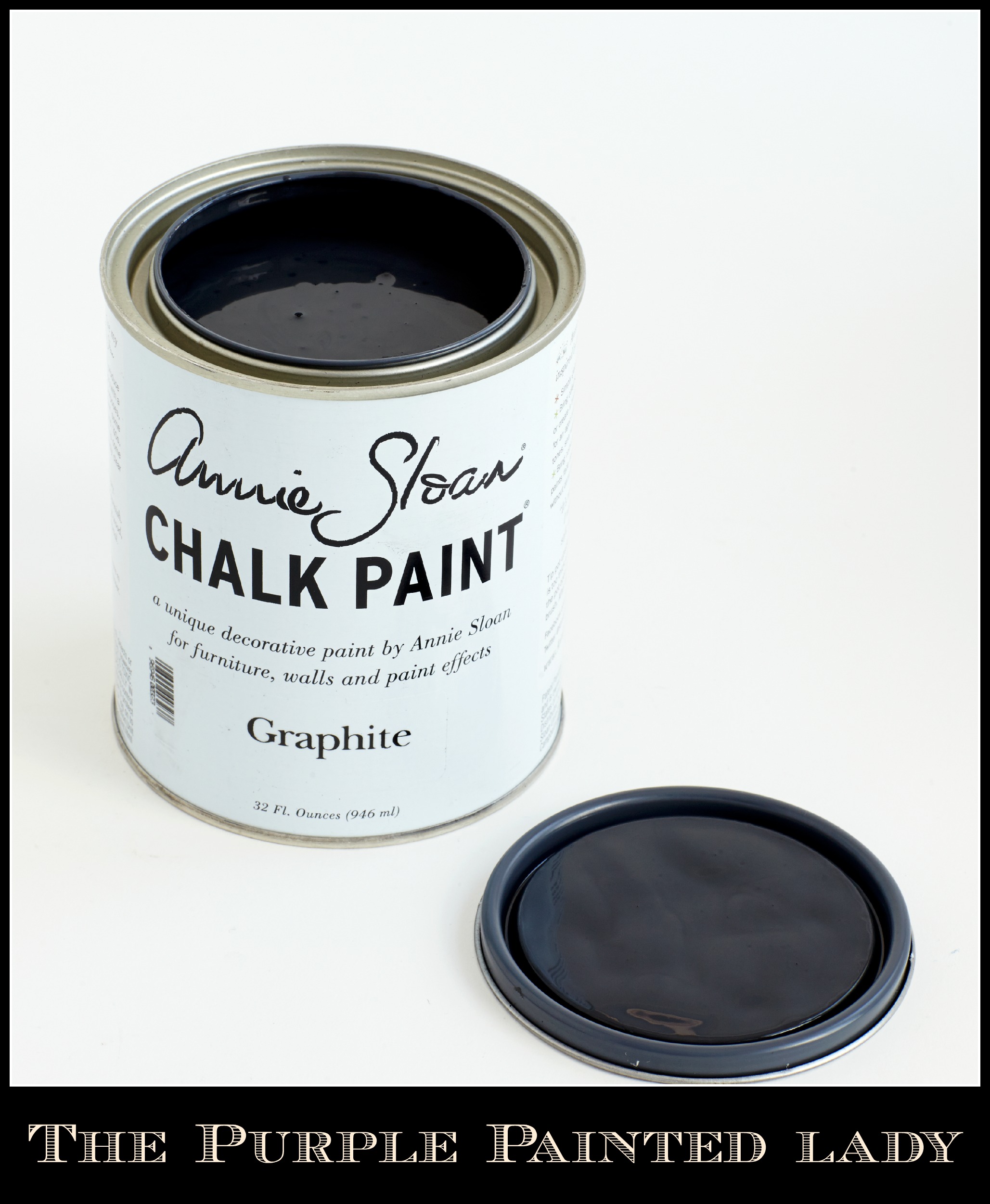
Here is what the dresser looked like before anything was done to it.  Not too pretty- but it had the perfect front surface for something fun to be painted on it! Not to mention it is all wood and well made. So…of course it was first painted with Annie Sloan Chalk Paint® Decorative Paints. The color used was Coco- which is a beautiful color – especially with Dark Wax applied to it!
If interested in purchasing Coco Chalk Paint®- click HERE.
This dresser was already painted with white Latex paint when I found it. I chose the color Coco for this project and it took 1 1/2 coats of Coco Chalk Pant®. NO sanding or priming prior either and did I mention I sell Chalk Paint® on-line? Click HERE if interested in shopping. And oh, what do I mean by 1/2 coats?
Well, after your first coat of Chalk Paint® dries- if you are applying a second coat with a brush (which you almost always need 2 coats of paint!) – often I will thin the paint by placing only a ¼ inch of water in a plastic cup with some paint. A good rule of thumb, is no more than 20% water added to the whatever amount of paint you have. And do this in a separate container, other than the actual paint can.
By adding some water- it allows the paint to be a little thinner and smoother and it will glide on easier and you will use less paint. (I will sometimes refer to it as a 1/2 coat.) Also, this is great if you are looking for more of a traditional “smooth” look with minimal brush strokes in regards to texture.

Once finished painting the dresser with Coco- it was time to jazz it up. I did not want to use a stencil and actually could not find one the size or in the style I wanted. But when it comes to stencils- some are a necessity when doing a replicating pattern. But in general I have found that they can be quite expensive and often- I do not do the same detailed painting more than once or twice, so I do not need one. And to have a custom stencil created- FORGET IT…very expensive$$$.
More importantly- I want to have a variety in the pieces I do, versus doing the same design again and again. I like to personalize an image and if you are savvy with using Paint Shop Pro (or some image editing software) you can.
So for the project I am going to step through below what I did. But just to share- if I was to purchase a big stencil to accommodate my design in this size- it would easily run a minimum of $100 to perhaps $200 retail- that is, if you could find one that matched this type of design. So instead, I suggest that you buy a projector off of Craigslist and print your transparencies on a laser printer. You will not regret it! And that is what I did….I just made a transparency and pushed the image up and traced it.
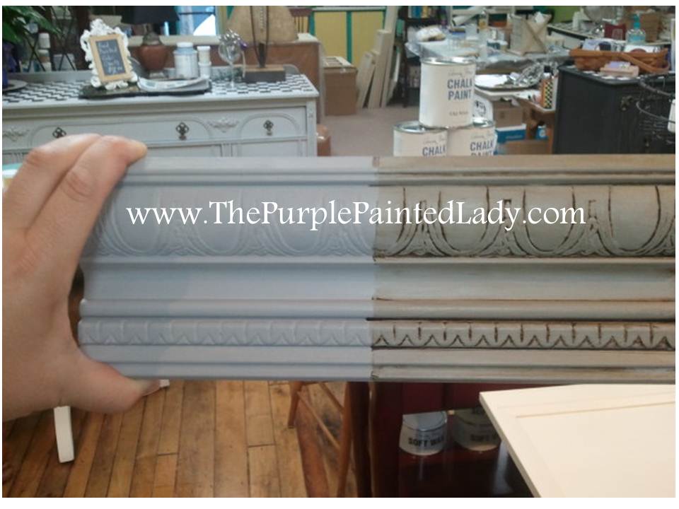
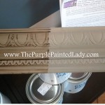
I used Graphite Chalk Paint® decorative paint by Annie Sloan to color within the lines. What makes Chalk Paint® so awesome is that it is very forgiving. Meaning when I paint in the traced lettering on the piece below – I am not concerned about uniform coverage of paint since I am going to “age” this piece by distressing it with sand paper and use Dark Wax once done. With a little 200 to 400 grit sandpaper…I will make the front of this piece as smooth as glass! And ….make the uneven paint – work to my advantage!

1. So, where do I go to get inspiration? Please allow me to introduce you to my Fairy Godmother! Visit The Graphics Fairy LLC website and browse. Karen – my Fairy Godmother (although she is probably much younger than me!) always has an infinite supply of the most incredible – inspirational images for me to choose from. And get this…all of her site- IS FREE! Crazy right?! 
Search for whatever you might have in mind. If you have no ideas, just browse some of the folders she has on her main menu. I guarantee, something will appeal to you!
USING A PROJECTOR
2. Once the perfect image is found (which there will be 100’s of!) Make a screen shot of the image and then create a PowerPoint image and save it to your hard drive. Print that image on to a transparency from my laser printer. If you have a basic ink jet – make sure to buy transparencies specifically for your printer type. Otherwise your ink will stay wet and will just smear. Kinkos or Copy Max can make transparencies for you if you cannot. (Note that I did not go into specifics from a technical perspective, because depending on if you have a mac or use Micorsoft and what revision you have- the instructions will vary!)
3. Using my ancient and inexpensive overhead projector, I push the image onto my furniture piece. Make sure to only begin this step when you have ample time to do the whole layout. Don’t plan on starting the lay out on one day and finishing it another because if you move your piece by accident or the projector gets shifted – nothing will line up and you will have a fun time (sarcasm) trying to align it all again!
Using painter’s tape- tape the transparency in place to your projector once you have it aligned, otherwise a nice breeze will come by and blow it off (Murphy’s Law.) 
I align my design by eye.
Always step back a good few feet and look at your piece from a distance.
Make sure to leave ample room between your piece and the projector so that you can comfortably stretch out or lay down on the ground without touching either, or you risk moving one! For this image, I gauged the distance from the top of the letters from a drawer seam to make sure that it looks uniformed before I start to trace my projection. As for the projector- find one on Craigslist for a minimal amount of money. Unless a projector was relatively new or came with a large inventory of bulbs- I would not pay more than $60 for one. (and for $60, I am looking for a top of the line projector) The most expensive part of a projector is the bulbs. Make sure to ask the current owner if they have any extra bulbs that they will give you with the purchase or confirm that the bulbs are still available to buy!
Another idea- I like to use this method for wall designs. At my 2000 sq ft shop in the village of Macedon- I have started to work on my Miss Mustard Seed Milk Paint display. Customizing your space is always cool, in my opinion. I used my projector to do this too.
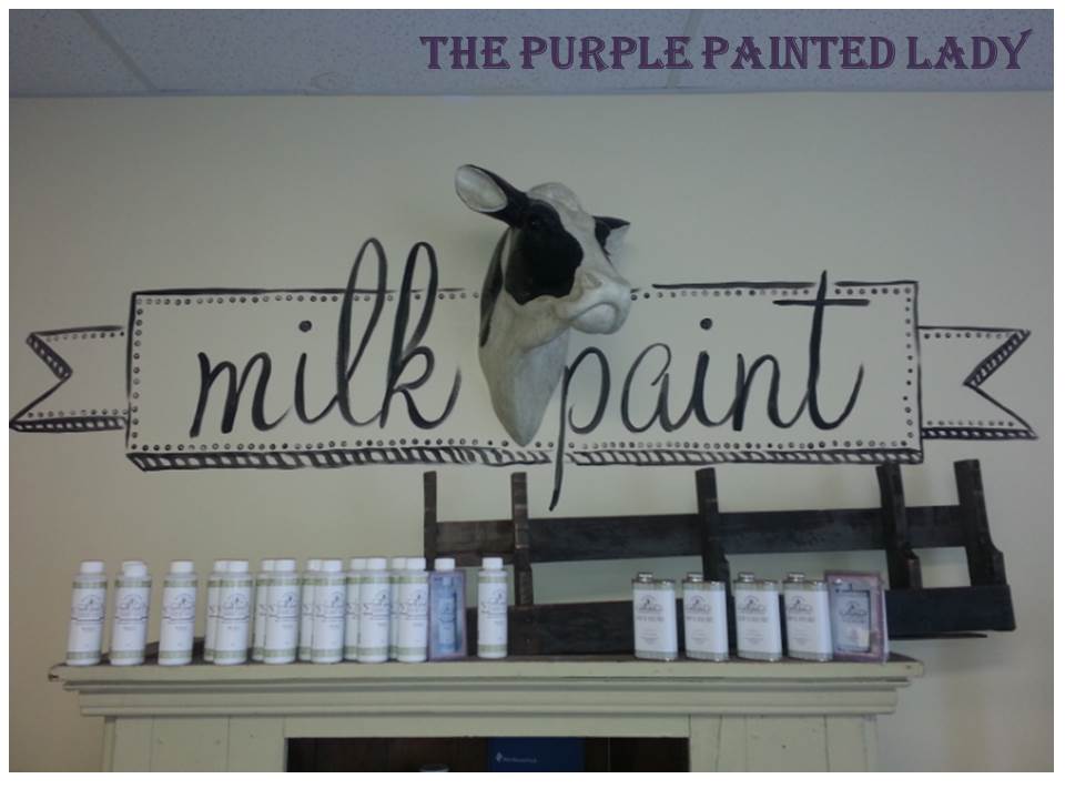
I still need to add “miss mustard seed” in an arc over my cute cow’s head, but I really like how it looks already!
4. Using a WATERCOLOR pencil– trace your image in a coordinated water colored pencil. Since I knew I was going to paint the lettering with the color Graphite, another gorgeous Chalk Paint® Decorative Paint by Annie Sloan- I used a dark colored pencil.  However, if I was going to use Annie Sloan’s Old White or Pure White, I would have selected the white or lighter colored watercolor pencil. The difference between regular “traditional” pencils that your kids use in school versus a water-soluble pencil is
what the material inside the pencil is made of. Typically when an artist who paints with watercolors (which I think you all understand what I mean by watercolor) …the person sketches out a drawing with a special kind of pencil as so when they apply water and paint – the outline from the watercolor pencil blends in versus just being an outline. Regular lead or graphite pencils just smear and contaminate your watercolor paint- or for that matter any type of paint. Even Latex! So- when I, The Purple Painted Lady paints a mural on a wall- I ALWAYS use a pencil made for watercolor art. Again the lead – have a water soluble material that blends when painting. Here is a LINK to some available. Color pencil leads are either wax or oil based, whereas watercolor pencils have a water soluble base. Again- (apologizing for the redundancy here) do not use a traditional lead pencil. The lead will only smear and depending on the color of paint you will be using- the lead will bleed through. Some people may suggest using a piece of chalk, but I do NOT. Do NOT use a Sharpie either. A customer of mine tried that, and the Sharpie seemed to smear when she applied the wax top coat. So, I like watercolor pencils and they must have a tight tip to make fine detailed lines, which is why I also have an electric sharpener that I use a lot! I have found that a piece of chalk is too bulky to draw in details. (and I like the details!)
When you begin to trace, be strategic. Meaning start on the top of the image and work your way down. This will prevent you from smearing your lines. This is especially important if working on a project when it is hot and humid. The moisture on your skin will smudge the water color lines.
The Purple Painted Lady has projectors available for RENTING from her Macedon location. If local, give her a call. 585.750.6057
5. Once your layout is done- celebrate! Now the fun part begins…painting it all in! 
I use artist’s paint brushes that I purchase at Hobby Lobby or Michaels Stores. For this project, I used a straight top brush that was about 1/3 of an inch wide and then two other fine tipped brushes for detailing and making whimsical lines. I also have a bunch of styrofoam plates around that I use to hold a little water and to remove some paint from my brushes when I get too much on them.
Some people will use paint markers, but be careful. Make sure to test whatever type of marker you are using prior with the wax or top coat you will be using. Some will smear or smudge- and you do not want that happening after investing time and energy in creating your design.
Begin painting in a strategic way. Since I am right handed, I always start applying paint on the top left of the image. That way- I can rest my hand that is holding the paint brush on the piece without worry of laying it in wet paint. This is important since you will create a nicer, straighter – more controlled brush stroke when your hand is resting on the surface, versus floating in mid-air.
6. I will share that the amount of time to complete what I have done so far is relative to your experience as a painter. The more you paint- the faster you will be. The old saying- practice makes perfect is very true! I completed what you see done in the photo ABOVE in about one hour and 15 minutes, and that includes painting the dresser (it does exclude drying time.) But don’t worry about the time if you are slower than me because it is not a race and in the end- what matters is you creating a beautiful piece. Painting, detailing, waxing…in the end I will have about 2 hours vested in this. Again- the more you paint- the faster you will be. I have been professionally painting pieces and murals for about 10 years now.
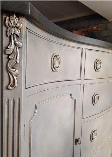
I then completed the application of clear wax as a base, and then the dark wax. Here is a photo of the front of the dresser with one drawer still waiting for dark wax. You can see where I have applied the dark wax. 
When I apply the dark wax- sometimes I will wear plastic gloves so the stain doesn’t transfer to my hands. I can share (almost 2 years from when I wrote this post originally) that I never wear gloves any more because I am pretty darn neat at doing this. : ) So, like I shared, there is a layer of clear wax on the dresser first and I did this for two reasons. One, it prevents the dark wax from “staining ” the paint directly. This is really important if using Old White or a lighter color of paint and you do not want that much intensity of darkness. (just a side note- that there are other application ways to apply dark wax. And two- the additional layer of clear wax adds more protection. I like to think of Dark Wax and the result of it as being very artistic.)
Check out THIS video of Annie Sloan painting a little cabinet and using both clear and dark wax.
To read more information about applying Dark Wax, please click HERE.)
I brushed on the Dark Wax over to give an aged effect.  I let the Dark Wax sit for about 30 seconds…literally almost applying it – then wiped it off in linear strokes. I took my lint free rag (use an old t-shirt cutting it up in pieces…you will go through a few rags for this project) Using your rag, remove the excess dark wax. We are not icing a cake and I only wanted the residual staining effect. I did leave a larger amount of the Dark Wax in the side grooves though. (again – feel free to visit this other post HERE to learn more about Dark Wax)
I made sure to push Dark Wax into the little cracks and dents of the dresser so to really gave the dresser that “Pottery Barn” aged look.
Now before you tackle a sacred piece of furniture that you inherited from your favorite great aunt with Dark Wax, I suggest you “practice” with Dark Wax on a small piece or a cheap garage sale find. This way you can get some experience and understand the approach on how to make your piece look aged, and not dirty. : ) Please make sure to read my post HERE to learn more about Dark Wax.
Below is a photo of the dresser finished and with the hardware installed. What do you think?
If you try this idea at home – please email me some BEFORE & AFTER images of what you did. takuntz@rochester.rr.com
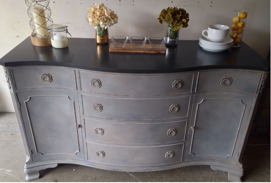
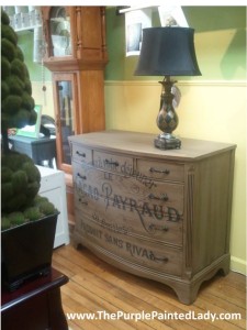
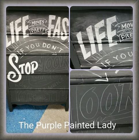
 Here are a few more examples of pieces we have completed using a projector:
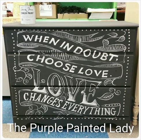
In the photo I have below with the quote, ”
Life Moves Pretty Fast. If you don’t stop & look around once in a while, you could miss it!”
– I used a white water color pencil. I will typically take the drawers out to paint the design, and then- using sandpaper- I distress my painted letters. This will create a super smooth finish. Note the white dust on the Graphite paint from sanding over the white letters. Do not worry about that because once I go over this with my Annie Sloan Clear Wax- the residual dust will disappear.
Transfer Gel by Artisan Enhancements® AVAILABLE at The Purple Painted Lady
Now, if you are not into purchasing a projector and sketching out your image- here is a another amazing option that streamlines this process. It is a product called product called Transfer Gel by Artisan Enhancements® that I am retailing at my Macedon store and here on-line – which is another option to help you make amazing pieces also. Click HERE to see this product.
So what is Transfer Gel by Artisan Enhancements®?
Transfer Gel by Artisan Enhancements® is a product that enables you to make funky pieces that others have done by hand in the past. It is a transparent fibrous gel that you apply over an image that you printed from either a laser jet printer or professional printed image from your local CopyMax or copying store. Both black & white images and color images work perfectly with this gel.
 So, how does the Transfer Gel work?
Well, first you find an image you love, print it to the correct size and remember to make it in the reverse that you want to see it. This is especially important if transferring lettering otherwise the wording will be backwards! Then, you lay your printed image onto your painted piece.
If you can lay your furniture down so the image is facing up ~ for example, if doing a dresser front- consider laying the dresser on its back. This is not necessary, but if you have a small piece- do it.
Apply the Transfer Gel by brush and use quite a bit of it covering the whole image in a uniform way.
Again, your image is face down so the printed image is facing the furniture, not you. And one last reminder- make sure print is mirror imaged.
Use a smoothing tool to adhere paper evenly to surface. I like the plastic scraper that I received with my Pamper Chef baking stone, but even an old plastic library card works.
Allow your printed paper to dry to assure the image has transferred. It is best to leave it overnight- or even 24 hours depending on the temperature and moisture in your area. (Don’t try to rush this – otherwise it will be like taking a cake out of the over after half the time it needs.) Some have shared that you can rush it by using a hairdryer- but I suggest you be patient and only use a hair dryer at the very end.
Ok, now comes the best part…I like to say, “the Christmas Morning moment!”
Mist the paper with water quite generously, then using a sponge or cloth remove/rub away paper the image. Now it is VERY IMPORTANT that you do not over work the removal of the paper since you could start to remove the transfer image. So, approach this carefully and slowly. (that means, you need to be patient!)
As always, it is best to test a small spot to make sure that the drying was totally completed.
Some have shared that if you get a funny outside haze circle- that is referred to a “halo” effect – after you have removed the paper- just lightly sand the edges of the image with a fine grit paper like 300 or 400 grit. Just like dark cars show more dirt, dings and scratches- this halo effect seems more evident on darker colored painted pieces.
Last, use the Artisan Enhancements® Clear Topcoat to seal. To access the Clear Topcoat in our on-line store click HERE.
I hope what I have shared has been helpful. Please feel free to email me questions if there is something you do not understand.
Thanks so much for reading my post and hopefully liking by Facebook page. And a BIG thank you to Karen at The Graphics Fairy LLC

Please visit our website if interested in ordering Chalk Paint®. We have it available for $34.95 per quart, we offer low/flat rate shipping and it always ships same day (as long as Pete, our UPS guy has not come already!)
In fact- there are many reasons we think buying through us is the best. Read THIS little post about what sets The Purple Painted Lady apart from the rest.
To visit our on-line store- click HERE.
Lastly, we share a lot more information to help you get the most functionality out of your Chalk Paint® on our Facebook page. Consider checking it out by clicking HERE. While there- kindly consider LIKING us.
Thanks again,
Tricia Migliore Kuntz ~The Purple Painted Lady ~
Design/Consulting, Kitchen Cabinet Refurbishing, Custom Painted Furniture, Chalk Paint® & Miss Mustard Seed Milk Paint Retailer & herRochester Blogger
PHONE: 585-750-6056
Come visit us:
At our MAIN STORE at 77 West Main Street in Macedon, NY 14502 OR

3200 West Ridge Road in Rochester, NY 14626 (The Shops On West Ridge) OR
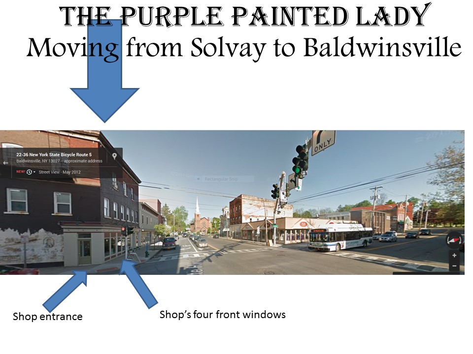
Our Syracuse, NY location as of July 1, 2014 at 1 West Genesee Street, Baldwinsville, NY 13027
Click HERE for Store hours and information.