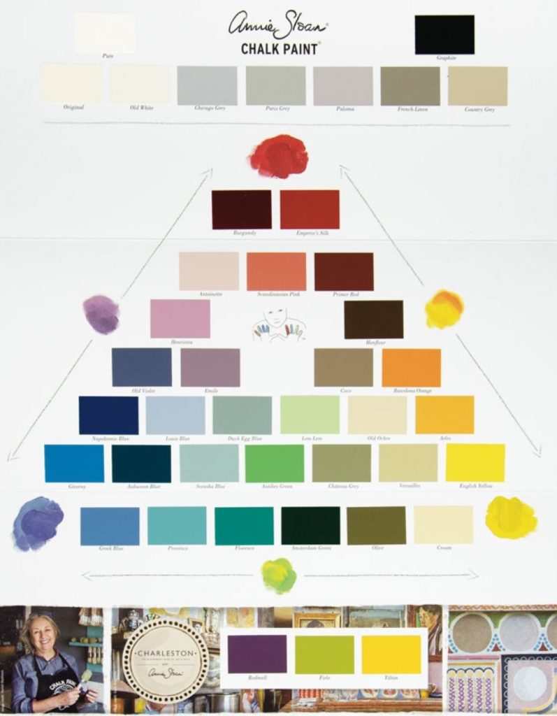
Don’t always judge a Chalk Paint® color just by that tiny 1 inch square on the Color Chart.
When you look at painted swatches against the bright white card stock of the color chart – it could give you false perception. So does holding the card flat vs vertical …the amount of light bouncing off the swatch can effect how your eye perceives the color.
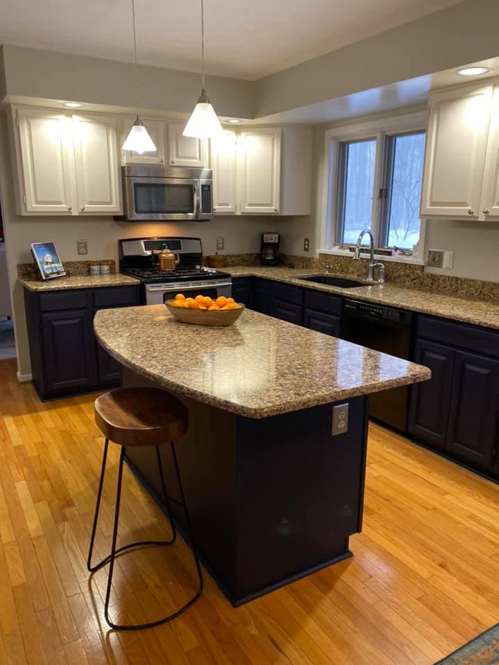
This kitchen project shown further down in this post is a perfect example of what I mean. The Chalk Paint® color Original – is a warm, slightly creamy, traditional white. When you look at the swatch, it has a slight ochre base to it, and may appear as if it is too creamy but once painted, it is a perfect soft warm white and seems much more neutral. Purchasing a sample pot of potential colors you are considering is always a great investment… especially if you are doing a large project like your kitchen cabinets. Paint one door and see how the color works with your wall paint color. Keep in mind other things like the amount of light you get in your home and your flooring and countertops can make a difference too.
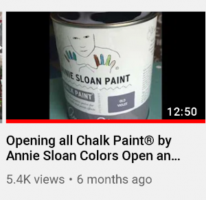
**** Sorry- I interrupt this post quickly to insert a link to a video I made where we opened every LITRE container of Chalk Paint®, stirred it and described the color. There is a key to jump to a specific color too. CLICK HERE to watch the YOUTUBE Video.
If you are are considering of purchasing Chalk Paint® for a larger project- like a kitchen or a whole bedroom suite consider investing in a sample pot of chalk paint first. They are very affordable and really the only way to truly see how a color plays in your home with your lighting, other wall colors, etc. Sample Pots are 1/2 cup.
So, if you have any questions regarding the swatches on the Annie Sloan Color Chart – just contact us. You can reach Trish by phone or text at 585.750.6056.
Thanks!
And YES! We are shipping online orders.
#originalchalkpaint #anniesloan #softwhitechalkpaint #thepurplepaintedlady